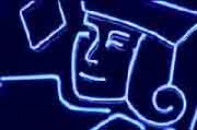
For those who celebrate, St Tube Map's day is here again!
It used to happen more than once a year but is now an annual changeover.
Here's the Great Switcheroo Ceremony at Liverpool Street yesterday.
The old map comes out and the new map goes in.
Sometimes a new tube map brings great changes like the addition of blobs, the appearance of trams or the naming of Overground lines. This time the tweaks are minor, especially on the map itself, but there have been presentational changes and some fool's decided to make the key even more complicated.
Change 1:new cover art
It's farewell to Map Projections by Agnes Denes and hello to Fast-Fish and Loose-Fish by Ellen Gallagher. Ellen is an American artist with biracial heritage who fished commercially before taking a fine arts degree in Boston and now exhibits internationally. What's unusual here is that TfL haven't commissioned this cover from scratch, the work's already appeared in a show at the Gagosian Gallery in Paris. It's one of three oil paintings on a maritime theme that Ellen exhibited in March, in real life measuring 116⅝ × 79½ inches, so you really are getting a work of art in your pocket.
The title comes from chapter 89 of Moby Dick which is also called Fast-Fish and Loose-Fish. Here Captain Ishmael explains the fundamental rules of the whaling industry, namely "A Fast-Fish belongs to the party fast to it. A Loose-Fish is fair game for anybody who can soonest catch it." In other words marked property is yours, unmarked property is anyone's, and the whole thing turns out to be an allegory for the slave trade. Nobody picking up the pretty red map is going to guess that. As yet Art on The Underground haven't published their usual word salad on the underlying meaning but the Gagosian described the work using the following top quality artbolx.
Built upon canvas-mounted sheets of ruled, gridded paper that are stained in a vibrant pink hue, then layered with brilliantly colored, thickly impastoed pigment and incised palladium leaf, each of the Fast-Fish and Loose-Fish paintings employs a material abundance from which Gallagher’s playful meditations emerge. She takes a sculptural approach to her process, often working paintings from multiple positions. Exploding their compositional grids into groupings of vibrant lines and biomorphic shapes, she melds Post-Minimalist abstraction with imagined ocean-floor topographies and phantasmal worlds.
Change 2:a new way to display the map
Time was when leaflet racks in stations held a variety of printed information. These days they only ever hold tube maps so someone's had the very sensible idea of making this extremely obvious.
The background on the leaflet rack is now bold blue with big letters saying POCKET TUBE MAP, as if TfL are suddenly proud to be giving the maps away. There are clues elsewhere as to why, chiefly three mentions of the Art on the Underground programme... "Putting art in the hands of Londoners for over 25 years". Many would describe Harry Beck's tube map design as art but it's the cover design being plugged here, not the increasingly convoluted interior.
Look carefully and there's another change, the appearance of the sponsor's name at the top of the poster. That's Reed the recruitment company who are the 2026 sponsor of TfL's flagship art programme, indeed this is the third year they've thrown dosh at Art on the Underground. The real prize for Reed is that they've managed to get their name onto the tube map itself - on the back at the bottom of the index (where ART ON THE UNDERGROUND is also written is slightly larger font size than before).
Change 3:a map update
• Colindale now has a step-free blob (because its lifts opened last Christmas)
• The IFS Cable Car is now the London Cable Car (and its terminals have lost their sponsorship)
I think that's it (for once it's barely worth publishing a new map)
Change 4:a wordier key
Alas someone's looked at the key and thought "Do you think perhaps we could show some more information on here?" Someone's done this a lot over recent years, adding the trams, adding stations you can walk between, adding Thameslink, and on the online map adding snowflakes if the line is air-conditioned.
In 2019 someone decided to add a special symbol for river piers you could walk to, placing them in a circle joined by a dotted line. The key then had two boat symbols, one in a circle and one not, both described as 'River services interchange'. But in 2026 someone has asked "to be even more helpful do you think we should describe the two boat symbols separately?" and now suddenly there are 18 words where previously there were three.
The new dividing line is 'less than 10 minutes walk to River services interchange' versus 'more than 10 minutes walk to River services interchange'. You're more likely to want to walk to the former, or be able to, is the underlying rationale. I hesitate to think how many people actually use the tube map to make a river connection, or are inspired to, but I bet it's a tiny fraction of a tiny fraction of 1%. To save you checking, here are the 19 stations with a boat symbol and which version they've got.
Less than 10 minutes walk: Imperial Wharf, Battersea Power Station, Vauxhall, Westminster, Waterloo, Embankment, Blackfriars, London Bridge, Tower Hill, Tower Gateway, Cutty Sark, North Greenwich, Woolwich Arsenal, Barking Riverside More than 10 minutes walk: Putney Bridge, Westferry, Canary Wharf, West Silvertown, Pontoon Dock
Only five stations are more than a 10 minute walk from a river pier, and they're the sole reason this wordy change has been introduced. So how far away are they really? I used TfL's Journey Planner to check, and here's what it said...
Putney Bridge: 7 minute walk to Putney Pier
Westferry: 7 minute walk to Canary Wharf Pier
Canary Wharf: 10 minute walk to Canary Wharf Pier
West Silvertown: 8 minute walk to Royal Wharf Pier
Pontoon Dock: 12 minute walk to Royal Wharf Pier
Ridiculously only one of these stations is actually more than 10 minutes away via TfL's own metric, and that's easily solved by alighting at West Silvertown instead of Pontoon Dock. The genuine edge case is Canary Wharf where the Journey Planner is incapable of distinguishing between DLR, Jubilee and Elizabeth line stations, so not fully accurate. My estimate is that Elizabeth line to river pier might in fact be 14 minutes, hence the use of an uncircled boat is genuine.
But do we really need a whole new symbol over-explained in the key on the off-chance that someone might alight a purple train at Canary Wharf and discover it's further than they thought to a boat? I'd argue not. What people really want to know is "what does the boat symbol mean?", not "how long might it take to walk there?"
Adding stuff to the tube map is always done with the intention of providing more information for the user, which seems laudable. But implementation invariably makes things more complicated or harder to follow, in the misguided belief that throwing everything onto the map somehow helps. This latest addition might help a few people a day at most. In the meantime it hinders everyone scanning down the key and trying to make sense of what the map shows... as do all the dotted lines linking stations to piers in the first place. Less is sometimes more, but on the tube map more is always more than necessary.
The only change that matters on the new tube map is that Colindale is now step-free, everything else is just extra noise.