London gazetteer quiz
London is a vast place, embracing within its borders hundreds of lesser locations. Some of these are well known (Westminster, Clapham, Romford, etc) whereas other place names are familiar only to locals and those with a bit of neighbourhood knowledge. Often it's small suburbs without a station which slip beneath the radar, or estate-sized areas within more well-known districts.
So for today's quiz I'm presenting you with a list of 24 place names. Twenty of these are proper London place names, and the other four I've made up. Can you spot the four non-existent non-London locations?
As a hint, there's one fake name in each column.
Try to spot the fakes before you open the comments box, because that's where the answers are.
You can confirm or disprove your hunches by clicking through to a gazetteer and/or map.
And then let us know how you got on.
Credit Crunch report: The vast car parks are fairly full, but you'd easily find a space. Queues of traffic stretch back along winding feeder roads to the NorthCircular, but at least they're moving. Would-be shoppers dribble off the double deckers in the featureless bus station, but not in large numbers. Hold open the door to the mall and there's still plenty of room inside. It's nearly nearly-Christmas, but you wouldn't guess. It's Brent Cross, it's the UK's first large enclosed shopping centre, and it's about to face its third recession.
Even in these tough financial times, the mall experience remains an attractive family day out, but now with the emphasis on window shopping. There's a dress you can't afford, and there's a pair of shoes that mustn't go on your credit card. Those chocolates look gorgeous but unnecessary, and no way am I paying four quid for a bagel. Nobody buys Swarovski crystals at a time like this, although a spin round Claire's Accessories shouldn't break the bank. Don't worry about buying some trifling luxury for the kid, because Junior will be pleased enough with a free balloon from McDonalds. Maybe a long walk round the Fenwick department store will pass the time, and then the same round John Lewis. Look, they're doing a meal for two for a tenner in M&S, bargain, and there's even fruit crumble. Best give the Apple store a miss, I think.
At the heart of the mall, beneath the central glass dome, the "My Brent Cross" promotion is underway. Some spotty youth and her lank-haired beau are perched inside a video pod waiting to talk to camera, no doubt telling the world what they so love about this place. Maybe it's the feeling of camaraderie they get from meeting up with their mates outside the Karma Kitchen. Maybe it's the opportunity to nick a pair of leggings from Miss Selfridge. Maybe this is the only decent place in the area to get away from the parents and do some pointless slouching. Or maybe it's the free central heating. Whatever the reason, this mid 70s mall experiment still has its legions of devoted fans.
But maybe not for much longer. Never mind the credit crunch, there's a new enemy lying in wait five miles down the road. If Brent Cross was London's first mid-conurbation shopping centre, then Westfield is its first all-encompassing retail megaplex. It opens on Thursday, and its extensive hinterland threatens to suck what little recessional trade exists out of existing local shopping centres. Why go to a nasty concrete box outside Hendon when you could visit a shiny glass amphitheatre near Holland Park instead? Why head for a far-flung Zone 3 stationon the hard-to-reach side of an enormous roundabout when you could arrive at the mall doors via a brand new Zone 2 interchange. Why do H Samuel when you could do Tiffany? There are a lot of nervous retail managers across West London at the moment, all hoping that this weekend isn't the last time their shops ever see normal levels of trade. It's shops in W12 which have the most to fear, obviously, but I'm certain Brent has its fingers firmlyCrossed.
Having started 'Next Train' Indicator Week at one end of my daily commute, I'm ending it at the other. I'm a bit surprised, because I didn't think Holborn's NTIs were anything special. But once reader Marc had pointed out the crude display on a separate platform, this station's signage shortcomings became all too apparent. Holborn's a perfect and up-to-date example of how uncoordinated the planning of these things still is. Installation by cretins continues.
Next train: Holborn
First to the eastbound Central line platform. It's where reader Rachel waits each morning, and where I stand each evening before I head home. Picture the scene - a straight tubular platform with a low subway bridge across the centre. Six months ago there were two 'next train' indicators, both of the long-standing green&orange type, one attached to each side of the overbridge. This meant that destination information was clearly visible from the majority of the platform, but alas not from a blind spot beneath the bridge. Pretty good, but not perfect. Holborn station is currently undergoing refurbishment, and new 'next train' indicators are part of the package. Perhaps sensibly, the new displays have been installed before the old ones have been removed. They hang a few feet further away from the central bridge, so there's no blind spot underneath any more. Unfortunately there's now a blind spot almost everywhere else. From further away the new signs completely block out sight of the old and, although they've been installed for months, the new signs are not yet functional. Installed by cretins.
So I stand each evening and stare at the new signs, wondering what it says on the old ones sandwiched behind. The new signs merely tell me I'm waiting for "Eastbound trains: Central line", which I know already, and they tell me what the time is in hours minutes and seconds, which I know already. The next train is for Idunno, and it's arriving Anywhen. Why oh why, if the new signs aren't yet plugged into the signalling system, did some cretin decide to install them several months early. I know I shouldn't be surprised, but I do despair.
So next to the northbound Piccadilly line platform. It's much the same story here - a new indicator installed before the old one has been removed. Thankfully this new NTI actually works, and it doesn't block the old one. Unfortunately it's been installed by cretins. The new 'next train' indicator has been attached to the ceiling immediately to the right of the platform entrance, which is (unsurprisingly) very close to a "Way Out" sign. This is especially bad news if you want to stand on the left half of the platform, ready to board at the rear of any arriving train. From here the "Way Out sign" obscures almost all of the dot matrix display, apart from the first four letters. If you're lucky, the first train will be heading to "Arno". If you're unlucky it'll be heading to "Cock".
Did the electrical contractors do this for a laugh? Or did nobody consider the unfortunate combination of truncated information and accidental filth? Surely TfL, if your trains go to Cockfosters, you should always think twice before you install anything. Evidently not. I'm still kicking myself for not waiting on the platform long enough. My photograph of this abysmal debacle only has one Cock in it, whereas if I'd hung around longer I could have hit the jackpot with two.
But this platform's not somewhere I wanted to wait for long. And that's because it's home to TfL's next generation of 'next train' indicators - NTIs that talk. If you can't see the the destination of the next train, either because some cretin has blocked it or because you're blind, then worry no more because it'll be announced out loud. Something like this...
"Piccadilly line. The next train to Cockfosters will arrive in 2 minutes. Next station Russell Square."
Surely this kind of announcement must be a good idea, making our stations aurally accessible to all? Well yes, except that the announcement doesn't stop there. About a minute later, as the next train is about to hurtle into the platform, TfL now insist on subjecting us to the following...
"Ladies and gentlemen, the next train will be a Piccadilly line service calling at all stations to Cockfosters. Ladies and gentlemen, please stand behind the yellow line as the train approaches. Use the full length of the platform and let customers off the train first."
Good grief, that's a bit excessive isn't it? As a regular commuter, all I want to know is where the next train is heading. Instead I'm subjected to 43 words of dressed-up waffle and patronising nannying. I know the next train will be a Piccadilly line service, because it's the only line to use this platform. I know the train will stop at all stations, because in this direction they all do. I don't need to hear "Ladies and Gentlemen" twice thank you, because I haven't switched gender inbetween. I know to stand behind the yellow line, even if the occasional exuberant passenger still forgets. I can't use the full length of the platform, because there's only of me and I'm not that wide. I don't need to use the full length of the platform because it's a Saturday afternoon and the station's not particularly busy. And I already know to let customers off the train first (although, OK, maybe TfL can't repeat this often enough because so many commuters appear to be inconsiderate self-obsessed me-first thrusters). But, before every single bloody train for the foreseeable future, is this really necessary? I don't want to listen to a perpetual sequence of on-message announcements, I just want to know where the next few trains are going and when they'll arrive. Otherwise, oh disembodied automated voice, please shut up.
I hope I haven't given the impression over the last week that all of London's 'next train' indicators are poor. Many are well designed, expertly positioned, unblocked by clutter and written in a font size large enough to read without squinting. The DLR ticks almost all boxes, for example. But there are still a lot of sub-standard, ill-thought-through, incompetent displays out there, providing an inadequate service for travellers and wasting public money. Installed by cretins. And each perfectly re-installable, should anybody at TfL actually care.
NTI scariness, category 7: Displays that talk • Tower Hill (District/Circle, eastbound): This one talks, but has an annoying habit of announcing a completely different destination to the one displayed on the board. As yet, bloody hopeless. • Euston (Northern): "The next train to Morden will arrive in two minutes. Next stop King's Cross St Pancras. Please stand back from the platform edge." • any more?
Installed by cretins: As tube week draws inexorably towards its climax, I'd like vent my spleen at the idiots who installed some of London's most useless 'next train' indicators. Just to be clear, this may not be the workers who wired them into the ceiling. It could be the electricians who installed the security camera directly in front of them. It could be the architects who thought that "behind a pillar" was the perfect spot for a list of upcoming destinations. Or it could be the designers who decided that "broad and shallow" was the perfect shape for a dot matrix display. Whoever it was, at so very many stations across the entire TfL network, my rant is the same. Installed by cretins. Here's a small selection of their inept handiwork...
Next train: Old Street Here we are on the northbound Northern line platform. You've entered the station, you've descended the escalator, you've walked down the stairs and now you're looking to your left to see which train's coming next. Good grief, which blithering idiot has installed a security camera immediately in front of the 'next train' indicator? And not just any security camera, but a limpet-like fixture attached to the curved ceiling by no less than two obstructive pipes. Morons. Except, hang on, that's one of the tube network's very newest 'next train' indicators - all matt black and sleek and shiny with pinpoint perfect lettering and (get this) more than three next trains. So my guess is that the chunky camera boom was here first and the damned expensive NTI arrived second. Installed by cretins.
Next train: Acton Town Here we are on the eastbound Piccadilly line platform. It's another one of those security camera & 'next train' indicator combinations. And you know what, it takes real skill to position a security camera in precisely the correct position to obscure the top line on a dot matrix display. The camera mounting is small and slim, and so is the word "Cockfosters", and yet engineers have still managed to synchronise both in precisely the same eye-line sector of west London airspace. Damned talented, that. Admittedly the view on the opposite side is crystal clear to all punters entering the station from the ticket hall. But from anywhere in the eastern half of the platform, an essential tiny strip of letters is blocked. Why oh why can't the cameras be a bit higher up, or the signs a bit lower down? Installed by cretins.
Next train: Acton Town Here we are on the eastbound District line platform, a few feet away from the disaster area described above. Yet again the destination of the next-arriving service is illegible. And yet again the blockage is caused by incompetently positioned surveillance equipment, although this time of a different kind. Blame the mini staff control room in the centre of the platform, with its windows facing forwards but not back. So how are diligent station staff to check the eastern half of the platform? Why, with a big square mirror attached to the wall, that's how. And this mirror perfectly obscures the left hand side of the 'next train' indicator, the useful chunk where the destination appears. Sorry, that destination's a secret, because what's more important is that station staff can check for abandoned luggage without leaving their bunker. Installed by cretins.
Next train: Bank Here we are on the eastbound Central line platform. This is the inner-curve banana-shaped platform where a disembodied voice announces "Mind The Gap" at extremely regular intervals. And here's a novelty. It's not TfL signage blocking this particular 'next train' indicator, it's an innovative advertising solution. Yes, you can blame CBS Outdoor and one of their newly installed overhead projectors for this wholly unnecessary obstruction. Last year you could easily have read how many minutes it was until the next train arrived. And now you can't, because there's a giant white box in the way, hanging pregnant from the ceiling. Is the Epping train arriving soon? Dunno, but you can always watch silent adverts for musical theatre and satellite television while you wait. I know which information I find more useful. Installed by greedy cretins.
Next train: Oxford Circus Here we are on the eastbound Central line platform. Look at that. A whopping great big Way Out sign plonked immediately (immediately!) in front of the 'next train' indicator. Who would do such a thing? Ah, well that's Health & Safety, that is. The most important sign on any underground platform is the 'Way Out' sign, because one day it might be essential (for a few minutes) during a nightmare evacuation. Unfortunately this means that for the rest of the time it's allowed to block everything else that day-to-day travellers might find useful, like where the next Central line train is going. But there's one thing here I really don't understand - why is the Way Out sign so bloody long? It's half blank, for heaven's sake, and it's the blank half which is blocking the really important information on the 'next train' indicator behind. This whopping great obstruction at one of the busiest stations on the network is totally unnecessary, and yet TfL's design guidelines require it. Installed by cretins.
Next train: Oxford Circus Here we are on the eastbound Central line platform. Hang on, that's where we were for the previous photo. But this is the other side of exactly the same 'next train' indicator. Double-sided incompetence, this. During the modernisation of Oxford Circus earlier this century, scores of loudspeakers were attached to walls across the station, and one of them ended up here. It's right up close to the NTI so there's no way of avoiding it, poking out diagonally across the destinations of the next trains to depart the station. Plain ridiculous. But that's nothing compared to the horizontal location of this particular display unit. Look, it's so wide that the only way of fitting it across the top of the platform has been to shove it into an alcove. Even when the next train is for 'Hainault via Newbury Park' there's still plenty of unnecessary blank width, but could somebody be arsed to design a slightly narrower 'next train' indicator? Could they hell. All modern dot matrix displays have to be wide, otherwise there'd be no room to write important messages about engineering works and unattended luggage. So Oxford Circus ends up with a too-wide box that doesn't fit, and isn't fit for purpose. And you know, that's why I liked the old lightboxes, because they were invariably narrow, and therefore capable of being positioned nearer to the tracks, and therefore visible. Today's one-size-doesn't-fit-all approach is evidently far too inflexible. Designed by experts, standardised by morons, installed by cretins.
NTI uselessness, category 5: Obstructed displays • Plaistow (westbound): Enter this platform down the stairs and you'll find that a narrow security camera arm casts its immediate shadow across the most crucial top-line segment of the 'next train' display. Only once you've walked one carriageworth up the platform does the view clear. Installed by cretins. • Finsbury Park (Victoria, southbound): Another security camera, again precisely eclipsing the destination of the first train, this time from the entire northern half of the platform. Installed by cretins. • Notting Hill Gate (Central, westbound): Yet another security camera debacle. Installed by cretins. • High Street Kensington (District & Circle, northbound): Blocked by Way Out sign from entire northern half of platform. Installed by cretins. • Bond Street (Jubilee, north and south): Blocked by Way Out signs. Installed by double cretins. • Stepney Green (District, eastbound): DTL says "The NTI is only visible there if you stand right by the stairs. Anywhere else and you have exit signs and CCTV blocking the view." • Mile End (Central, westbound): Ah, the bugbear of my daily commute. There are two 'next train' indicators on the westbound Central platform, one at the foot of each staircase. But stand inbetween the two, as I do every morning, and you can see neither. One NTI is singled-sided only, and the side facing the gap beneath the stairs is blank. And the other NTI is hidden perfectly behind a Way Out sign, so that's bloody useless too. Over the years I've learnt that I can just see the extreme right hand side of this dot matrix display if I walk right up to the yellow line at the platform edge and stick my head out into the danger zone. If the final letter is "s" then the next train is at least "2 mins" away, and if the "s" isn't there then the next train is a mere "1 min" away. As to where it's heading, there's no hope of knowing until it arrives. I stand each morning in an information-free dead zone, courtesy of TfL's incompetent engineers. Installers of the cretinous. • any more?
I did wonder if perhaps the Oxford Circus eastbound Central line 'next train' indicator was London's very worst example of contractor-led signage functionalty incompetence. But I have one more fecklessly located display up my sleeve, with which I'll round off this series tomorrow. Not just recklessly incapable but downright insulting, and the perfect indication of where TfL's NTIs are heading in the future. Installed by more cretinous cretins than usual.
Some tube stations are really complicated places to negotiate, not because there are several lines but because there are several possible destinations. These are multi-platform hubs, and it's essential to end up on the correct platform in order to board the correct train. Arriving passengers need clear signage which amalgamates all travel options, as for example provided by banks of purple-topped screens on the Metropolitan line at Baker Street. But other same-line interchanges can be a complete nightmare. And, by your common consent, the very worst of these is the District line's frenetic epicentre at Earl's Court.
There are only four District line platforms at Earl's Court, two (adjacent) westbound and two (adjacent) eastbound. You wouldn't think it would be difficult to stand on one island or the other and wait for the next train. But it is. And the problem is very simple. Each platform has its own 'next train' indicator which indicates the next train to arrive on that platform only. Whichever platform you choose to stand on, it's extremely hard to tell what's due to arrive next on the platform nextdoor. Wait, shuffle check, shuffle back check, wait some more, shuffle shuffle check, shuffle wait. It's a right pain, and during rush hours a sure-fire recipe for clogged congestion.
As on much of the rest of the District line, the signalling system at Earl's Court is archaic. No flash electronic 'next train' displays here, just a very old-school system involving illuminated arrows. But maybe not as old school as you remember. There used to be some genuine heritage lightboxes here - big compartmentalised displays with elegant white text on a bold blue background. Like this westbound, and like this eastbound. Proper museum fodder and very characterful, but not 100% useful. Alas at the end of last year they were replaced, and by something less gorgeous but equally dysfunctional. There are now lots of new signs spaced out along each platform, each with a nod at how things used to look, but each little more than a bland list in block capitals beside a box of cheap-looking arrows. Current signalling permits nothing more useful.
Eastbound, platforms 1 & 2: There are two distinct choices, although the destination board makes things look far more complicated. Do you want to head north via High Street Kensington or east via Victoria. Sorry, but your next train could be arriving on either platform. Shuffle, check, shuffle, check. A frequent bugbear occurs when both platforms are occupied by trains travelling in the same direction. What most passengers then need to know is not the final destination but which train will be leaving first. Because there's nothing worse that sitting expectantly in your carriage only to see the other train heading out of the station first. Not a clue. Oh hang on, maybe there is. One single illuminated sign hung high over the platform (above where the old indicators used to be), and most definitely not easily viewable from the full length of the station. Sheesh what a disjoint mess this station's signage is.
Westbound, platforms 3 & 4: There are four distinct choices, so which train's due next really matters. It's still not easy to tell from the indicators, though, as commenter slabman knows all too well... "Invisible from more than 2 metres away and placed at the head of the stairs from the Piccadilly, which opens into a bedsit sized space bounded by pillars and a lift. So, a crowd gathers there to watch the indicator and fight for position with the commuters coming up the stairs. Brilliant!" And commenter Steven adds... "On emerging from the Piccadilly Line and seeing a train about to leave, one has to fight through people to locate a board to identify which train it is." Even once you're on board, trains here can wait and wait and wait for no obvious reason. Changing trains at Earl's Court is no fun whatsoever.
But there is hope. At the moment the platforms at Earl's Court are covered with scaffolding, right down the middle of each - a series of blue portakabin-type hideaways propping up a forest of pipes and tall poles. It's as if the Ideal Construction Show has relocated from the nearby exhibition hall and set up shop in the heart of the station. And it's all this scaffolding which is blocking sight of one platform's signage from another. One day, maybe, if Metronet ever clear the whole lot away, viewing the whole picture might get a whole lot easier. But what's really needed here (and at similar stations on the network) is a single 'next train' indicator listing destination, time and platform for the next three-or-so arrivals. You know, like most National Rail stations have. In the meantime, if you want to know how many minutes away the next service to Olympia is and where it'll appear, don't hold your breath.
NTI uselessness, category 4: Displays giving passengers the runaround • Edgware Road (Circle/District/H&C): Personally, I despise Edgware Road even more than Earl's Court. It's a very similar set-up with two pairs of island platforms, but this time with the added complication of terminating trains. Westbound or eastbound? It's not always easy to tell. Trains pause here for long periods of time while waiting for a gap in the service, and again it's often nigh impossible to tell which is the next train out. One of the 'next train' indicators here glows blood red, not orange, which I always find very unnerving. And at the foot of the stairs, as commenter Ben points out, there's quite possibly the worst 'next train' solution anywhere on the network. The main dotmatrix display for all four platforms is upstairs on the concourse near the ticket hall (because eastbound trains can leave from any of three platforms). Downstairs, instead of having another repeater display on the platforms, they have... a CCTV screen fed from a camera pointing at the concourse display. The text is tiny and blurred, and often blocked by passengers walking in front or standing around with suitcases. It's cheap and it's nasty and it looks so desperately amateur. If Edgware Road ever becomes the lynchpin of a new non-circular Hammersmith and Circle line, I dread to think to imagine how appalling changing trains here might become. • Wembley Park: Your next southbound Metropolitan line train... is it platform 5 or (long scurry across bridge) platform 6? It's not always obvious. It may look like 5 (next train 1 min) but many's the time a slow train's sneaked ahead into 6, opened its doors to an empty platform, and pulled out before anyone could reach it. • Whitechapel: Your next westbound Hammersmith & City line train... is it a through service or is it departing from the 'eastbound' platform? There's a bridge and two flights of stairs between the two, and absolutely no clues for waiting passengers which it might be. • Plaistow: Your next westbound Hammersmith & City line train... is it a through service or is it departing from the bay platform? There's an incredibly long walk (up, over and along) between the two, and absolutely no clues for waiting passengers which it might be. • any more?
For my third category of well dodgy 'next train' indicators, I'd like to turn to those which present incorrect information. I'm not talking imaginary tube minutes either, I'm talking proper bona fide errors. Here's one such mini disaster area, on the southbound Victoria line at Highbury & Islington. Everything's working fine, except that the left hand side of the display has had the electronic version of a stroke, and the first three characters of every destination have vanished. OK, so that's not too much of a problem on the Victoria line, where virtually every train is going to XTON and only a handful to TORIA. But repairing these semi-broken signs never seems to be a TfL priority. And sometimes the incorrect information can be far more annoying...
NTI uselessness, category 3: Displays giving incorrect information • Seven Sisters (eastbound): Nico says "Often lies outright - sometimes advertises the first 'Stow train as being as much as 14 minutes (14 minutes gap, on the Victoria Line!) away as one comes rumbling in." [photo] [for TfL response, see comments box] • Queen's Park (Bakerloo southbound): I've never known a 'next train' indicator to lie as much as this one. The first train is almost always to Elephant & Castle, which is correct, but its arrival time can be purely fictional. If the time's 11:06, the next train might be given as arriving at 11:07. And then suddenly it'll be 11:08, and then 11:09, and then 11:10, and so the interminable waiting continues. And all because trains can emerge either from the sidings north of the station or from the tracks down from Willesden Junction, and the signalling system rarely seems to have a clue which. • any more? (there must be more)
If you want to see a motley collection of ancient next train indicators, head to Baron's Court. Two thin fingers of platform, each with Piccadilly line services on one side and District on the other, and possibly the easiest interchange on the entire tube network. It's been a very long time indeed since anybody at London Transport installed any new 'next train' indicators here. The two westbound platforms still have those old black lightboxes, one simple, one rather more complex (for everyone who needs to know whether the next train's stopping at Turnham Green or not). And none of these new-fangled digital clocks, oh no, but a proper analogue dial hanging inbetween marked out in Roman numerals. Boris would approve.
But Baron's Court's unsung jewel is the heritage 'next train' indicator on the eastbound Piccadilly line platform. This is how proper station information used to be. A chunky arrow at the top of the sign to indicate on which platform the next service is due. Then 13 glass segments, each with a different destination lurking behind, one of which lights up when a train's on its way. Lovely isn't it. You could almost imagine Trevor Howard and Celia Johnson meeting for a passionate embrace in swirling fog beneath the lightbox. By modern standards, however, this is rubbish. It makes no attempt to mention how many minutes away the next train is. It can't cope with unusual destinations caused by engineering works. And TfL can't scroll important security messages about unattended luggage across the bottom. Actually, I knew there was a reason why I liked it.
There are fewer and fewer of these very old 'next train' indicators on the underground network today. Every time a station gets upgraded (or, in heritage terms, vandalised), these old workhorses are being ripped out to be replaced by something more modern and more functional. And I can see why, because more information has got to be a good thing. But I shall still be sorry to see the last of the old guard go. I hope that this one survives a little longer.
NTI uselessness, category 2: Stations with ancient heritage displays • Upton Park (westbound): This is no ordinary lightbox, this is a burnt-into-the glass lightbox. It doesn't matter whether a train's coming or not, both line options are permanently visible. Look carefully and you may see that one line is more illuminated than the other - that's the service arriving next (sometime). One thing's for sure, however, there'll be no Metropolitan line train trundling down these tracks. There hasn't been for the last 18 years anyway. And any traveller who takes the sign's advice and decides to change for the Metropolitan line at Aldgate East will be sorely disappointed too. As commenter Venichka says, "while one is all for heritage features, accurate non-misleading information is more important." Few objects sum up TfL's cash-strapped-ness better than this particular sign. • along the District/Piccadilly line either side of Hammersmith (including Acton Town) • Uxbridge (they really don't make them like this any more) • Cannon Street • any more? (and no, not Earl's Court, not any more)
Time once again for diamond geezer to go totally tubular, with yetanotherweek devoted to the London Underground. Except this time the week starts on a Tuesday. And, just for a change, I'm devoting the entire series to one particularly annoying station fixture - 'next train' indicators. Because too often they're rubbish. And here's part 1 of why...
Next train: Bow Road
Forgive my indulgence if I kick off a week of ranting about 'next train' indicators by telling you about my local station. In particular, that's the new(-ish) electronic displays at Bow Road. This is the station I use every morning, where I stand expectant and bleary eyed awaiting a train to carry me westward. Sometimes I care about which train is coming next, because it makes a difference whether it's heading for Tower Hill or Kings Cross. Usually I don't care which train's arriving next, because every train on the District and Hammersmith & City lines goes to Mile End, which is where I want to change. But I always care about when it arrives. And there's the problem.
Until three years ago, the eastbound 'next train' indicator at Bow Road looked like this. Standard mid 20th century issue, just a lightbox with illuminable destinations, all black and simple. The indicator on the westbound platform was held together with sticky tape and was even simpler. No destinations here, just an alternating display to tell passengers whether the next train would be on the District line or the Metropolitan line (highly misleading because the Hammersmith and City usurped the Metropolitan out here way back in 1990). And also no overt indication either as to when the next train would arrive. When a westbound train was expected, the box would light up less than a minute before the train rattled into the platform. If the next train was more than a minute away there were no clues, nothing. A blank box could mean two minutes (wait on platform), could mean ten (exit station and walk to Mile End), could mean no trains at all (go home).
So Metronet ripped the old boxes out and installed new state-of the art 'next train' indicators' instead. Huge long dot matrix displays, weakly lit in orange, with updated more detailed scrollable information. Now the westbound indicator could tell us where our trains were going, be it Richmond, Ealing Broadway, Wimbledon or Hammersmith. And, erm, that was it. Still no indication of how far away the next train was, nor any mention of where trains two and three might be going. In short, this expensive upgrade provided virtually no value-added whatsoever. Indeed, given that the new indicators were five seconds slower than their predecessors in announcing the arrival of an approaching train, one could argue they were worse.
Meanwhile, up in the ticket hall, a new 'next train' indicator appeared. It was one of the first of a new breed appearing across the network, listing upcoming destinations to passengers fresh off the street. Alas, this provided no better information than on the platforms. Indeed, with any advance warning being less than a minute, this ticket hall sign usually signalled a train that was already rushing into the platform below. I know, from wearisome experience, that every time I enter the ticket hall to see a westbound train flashed up on the board, I have a less than 50-50 of getting downstairs in time to board it. Sorry TfL, that's not useful information, that's impractical optimism.
And the reason this really annoys me is that at Mile End, one minute down the line, the 'next train' indicators are fully functional. Westbound passengers know precisely where the next three District/H&C trains are heading, not just the next one. And they also know how many minutes away each of those trains is, up to a maximum of six. Hmmm. If Mile End passengers have maximum information, it really shouldn't be rocket science to provide the same half a mile away at Bow Road. It's not as if trains appear or vanish in the tunnel between the two - everything that arrives at Mile End must previously have passed through Bow Road. But no, one station gets the full monty while the station nextdoor merits no monty at all. I feel like a lesser class of traveller.
But there is a reason for TfL's apparent incompetence. It's the signalling that's rubbish, not the displays. Metronet installed the best most appropriate displays available back in 2005, but the District line's signalling system has yet to catch up. Bow Road's 'next train' indicator displays may look modern, but as yet they're incapable of displaying any better 'next train' information than their predecessors. Heritage cabling infrastructure provides only very limited last minute information, and nobody's yet thrown sufficient millions at the signalling problem to fund an upgrade. One day these next train indicators will be able to tell me how long it is until the next three trains arrive, but right now enabling that information is not a priority. I live in hope. But I'm not holding my breath.
NTI uselessness, category 1a: Stations with what look like modern displays, but which await a signalling upgrade
• most of the District line east of Mile End (& especially east of Barking)
• the Metropolitan line west of Rayners Lane: Shiny new displays on both platforms have nothing to report. At Ruislip Manor a carefully positioned leafy branch blocks physical sight of the next train until it's pretty much arrived. Thankfully the lines out here attempt to run to a predictable timetable.
• the Piccadilly line between South Harrow and North Ealing: modern displays, zero information
• Wood Green (southbound): Martin says "the indicator only tells you about the next train as it's pulling into the platform. Apparently this is due to the system's inability to cope with trains which might be emerging from the sidings just to the north of the station (although that doesn't happen very often). The other day it had got the idea that an Uxbridge train was imminent, so that was permanently displayed on the top line, while the train that was actually about to turn up was displayed as the second. Bravo!"
• Turnham Green: Alex says "Big LED screen replacing little light up one with no extra info. Two minutes warning about the next train."
• Ravenscourt Park: Phill says "Only shows the direction of the trains, and occasionally a no smoking flashes up. Even in the ticket hall they have a mini one and all it says is eastbound and westbound. Only been there a year."
• Ealing Common (eastbound): Chloe says "Both platforms only tell you the destination of the approaching train when it's almost in the platform, but the eastbound also flags up "special" at various times in off-peak hours, to indicate that the District Line train pulling into the platform is actually heading for the sidings just past the station, and is just stopping while they alter the points. It's that 'ah, train!...oh, not my train' feeling. And yet someone always walks up to it and presses the button."
• Turnpike Lane
• any more?
NTI uselessness, category 1b: Stations which have no 'next train' indicator whatsoever (awaiting signalling upgrade)
• the Hammersmith & City line between Hammersmith and Paddington (including the newest station on the Underground - Wood Lane). No point in having a 'next train' indicator if the current signalling can't support it. Please listen for announcements.
• West Kensington
• any more?
This is a photo of my Dad. Circa 1939-ish. Having fun with a pram.
Seven decades have now passed. And today this cherubic toddler celebrates his 70th birthday.
I am, of course, nothing like my Dad... I can't paint to save my life. I have no interest in expert gardening. None of my photos has ever won an award. I won't be allowed to retire in my 50s. I don't know a dovetail joint from a mortise. I've never been camping in Italy. I can't bake prize-winning rock cakes. I have been known to break the speed limit. There are no photographs of me in a woggle and short trousers. I have never been a leading national authority on scientific matters. I don't wake up every morning with someone to chat to. I am not a pillar of my local community. I don't have grandchildren. I hate cauliflower. And jazz.
Or maybe we're more similar than I realise... We share a sense of humour. Whenever I sneeze, I think I sound exactly like him. We're both annoyed by the shoddily imprecise and the carelessly misleading. He blogs (and no, I'm not telling you where). We both, independently, bought the same beige sweatshirt from Primark last year. Neither of us have ever voted for... you know, them. We both leave the room when Strictly Come Dancing comes on. Given the choice of a job we believe in or a job that earns more money, we'd both pick the former. I learned my positive outlook on life from him. We're both looking forward to a nice slice of cake this evening.
Before the afternoons darken and the leaves shrivel, there's still time for a glorious autumnal walk in the Surrey Hills. And where better than the peak of the county's chalk uplands, high on the North Downs, at BoxHill? It's not a much-loved visitor-packed viewpoint for nothing. I visited for the first time last Sunday, in surprisingly decent sunny weather, and found the entire experience wholly uplifting. Follow me.
To the car park of the Burford Bridge Hotel. It's unexpectedly simple to get here, via a range of different means of transport, and I'll tell you how at the end of this post. For the time being however, we're off for a hike. It's this hike here, which you can print out and take with with you when you visit. Look up from the A24 and you can see tiny figures ascending the grassy hillside, high above the trees, just a few hundred metres from where we're standing. That's where we're heading, through that gap between the hotel and a hedge, past the National Trust sign. Come on, there are steps, how tough a climb can it be?
Sheesh, that's tough. This is a mighty steep ascent - not exactly mountaineering conditions but still relentlessly upward. It's probably a good idea to stop for a breather before too long, before your heart explodes. Don't worry, you're already so high up that you can turn round and admire the view without looking like you're merely pausing to catch breath [photo]. And continue. The steps peter out after a while to be replaced by a sheer chalk path, and the rocky surface is unexpectedly slippery even in bone dry weather. You might be better off a few metres higher, walking on firmergrassland, striding higher and higher above the Mole Valley. Damned pretty, innit?
At last the contours thin and the path levels out, still climbing but now far more gradually. To the north, across a deep V-shaped ravine, a narrow zig-zag road can be seen clinging to the hillside. It's a mighty testing ascent for cyclists, and a lot of fun for bikers, and probably quite enjoyable in a car so long as you don't meet anything coming the other way. If we keep walking above the cliff edge we'll meet these vehicular travellers at the top soon enough. Onward and upward, then fork left into the woodland past a highly unlikely defensive fortification - Box HillFort. This low concrete and brick structure was built on the hilltop in 1899 as part of London's southern civil defence. It's seems a ludicrous position to defend because any enemy with any sense would march down the valley instead, but that's Surrey for you.
And then, suddenly, civilisation. We've hit a National Trust tourist hub, featuring gift shop, information point and "servery". That's upper-middle-class for café, of course, and it serves up tea and soup and sponge and stuff. Perfect for dismounted muddy mountain bikers and for spotless families recently disgorged from their 4×4 in the nearby car park. Several downland walks kick off from here, the most popular of which is also the shortest - across to the ice cream van and down a grassy slope to the viewpoint[photo]. A huge expanse of green farmland spreads out beneath you, from the nearby town of Dorking way out towards the South Downs in the hazy distance. Double 99 cornet, anyone?
Now for the descent. The path heads into the woods past John Logie Baird's experimental hideaway (before television there was noctivision), before dropping away down a flight of steps. There are a heck of a lot of steps, and you'll get an increasingly smug feeling as you pass wheezing, grimacing, panting visitors making their way oh so steadily upwards. Look, some have even brought toddlers, and pushchairs, and are lugging both impractically up the hillside. Roll on the day when these kids can finally walk unaided without screaming.
And at the bottom, to complete rural perfection, a set of hexagonalsteppingstones lead across the Mole. Wimps who fear slipping into the water can detour via a recent footbridge, but it's far more fun to tread carefully across the stones (minding any dogs scampering energetically between your legs). Pray you don't meet a coach party coming the other way, else you could be waiting on the riverbank for rather a long time. From here it's only a few yards to the main road in the valley, and then a short walk along the pavement returns us to the Burford Bridge roundabout. There are an awful lot of motorbikes on the dual carriageway, aren't there? I wonder why that should be...
How to gethere:
• By car: On the A24 between Leatherhead and Dorking. • By bike: The very best thing about the Burford Bridge car park is Ryka's restaurant[photo]. It's a homespun burger takeaway with a few tables inside (and lots of picnic tables outside), and it's become the major focal point for hordes of southeastern motorbikers. On a sunny weekend afternoon there'll be hundreds of motorcycles parked in the upper car park, some with reverential crowds around them, others revving up for a buzz round the area. You may have to queue for your cheeseburger and chips, but they beat the organic flapjacks at the top of the hill hands down. If only all roadside caffs were as special as this.
• By train: There's a regular service down from London to Box Hill & Westhumblestation, taking less than an hour. Very doable.
• By bus: Believe it or not, you can get to Box Hill on your Oyster card using a London bus. The 465 runs hourly from Kingston on Sundays (every half hour on other days of the week) and drops you off right at the foot of the hill.
• On foot: Go on, make a day of it. I walked to Box Hill from Leatherhead, following the Mole Gap Trail along the river, across the railway and along a high wooded ridge. Great walk, great views, and envious real estate.
As logos go, it's a classic. It's damned simple - just a bar on a circle. It's as iconic as the tube map, or maybe even more so. It's the London Transport roundel. And it's celebrating its centenary this year.
If you're travelling round the Underground today, only a handful of places remain where an original-style roundel can still be seen. One location is at the foot ofthe stairs on the Districtlineplatforms at Ealing Broadway, while another lurks deep beneath the surface at CaledonianRoad. And then there's Covent Garden, right up at the far end of the westbound platform beyond the safety barrier where no mere mortal is permitted to tread. It's a very raw piece of signage, just a blue rectangle across a red enamel disc, with the station name written in some ancient font. But it was a first attempt to introduce consistent visual clarity for passengers, and remains perfectly recognisable to this day. The disc became a loopy circle in 1917, and rapidly spread across the entire network of buses, railways and coaches. I could tell you more, but why bother when the London Transport Museum has put together a perfectly detailed online illustrated history of 100 years of the evolving roundel.
TfL's centenary extravaganza doesn't stop there, oh no. A trio of commemorative roundels have been commissioned - one outside St James's Park station, another at New Shepherd'sBush and a third at Wood Lane. And there's also a celebratory (and rather cheap) exhibition with the catchy title of 100 Years, 100 Artists, 100 Works of Art. The title reveals the concept. The folks at Art On The Underground asked a ton of artists to knock up a bit of art inspired by the roundel. Cost so far, zero. Then they hung all the artworks in a school hall in Shoreditch. Cost so far, probably not much. And (starting tomorrow) they're going to auction off a print of each work in an eBay-style auction. Ultimate profit, probably quite a lot. Value-for-money obsessed Boris is no doubt very proud that these days even heritage contributes to TfL's coffers.
The exhibition's only open for three weeks, so I popped down last night to take a look. Annoyingly the nearest stationdoesn't open for two years, so I faced a considerable trek to reach the backstreets around Arnold Circus. Erm, I think it's around here somewhere, that looks a bit like a Victorian school, where's the way in, and is this door actually open? Ah yes. A welcoming committee of three girls awaited, sat behind a desk piled low with unbought merchandise. And then onward into the high-windowed school hall, a room I had almost to myself. Cue the art.
Ooh, this was a rather diverse selection. The artists have interpreted their brief in a multitude of different ways, some graphic, some literal, some photographic, some abstract and some just wonderfully obtuse. Some looked like the heritage posters of old, while others were considerably more modern. Some made me go "wow, that's clever", and others made me think "pah, I bet they dashed this rubbish off in a few minutes". Proper art, then. But then you can't really go wrong with a roundel. Something circular-ish with something rectangular-ish across it, tarted up a bit, done.
I amused myself by wandering the walls trying to work out which artwork I'd bid for, if I actually did that sort of thing. My eye was taken by the more abstract designs, using the roundel as part of a repeating moquette or as a long distance reveal. Maybe the roundel as a flock of birds, or as a Mobius strip, or as a hole in a sliced loaf. Or maybe the atmospheric landscape in which a shimmering roundel reflected on a tree-shadowed pool. Sir Peter Blake had taken a very colourful geometric approach, which worked strikingly well. But my ultimate favourite was picture number 18 by Henry Coleman, the Venn diagram in which a sea of blue bars morphed effortlessly into a army of red circles. I like my art clever but simple. Which is, essentially, why the adaptable old roundel has survived the century.
Places to go after you've attended Outpatients and been fobbed off with a brusque junior doctor: number 1 The Royal London Hospital Museum (Open Monday to Friday, 10am-4.30pm)
You'd never find it by accident, tucked away in a crypt in a Whitechapel backstreet. Head through hospital reception, across a courtyard garden between wards and clinics, then look around for the swallowed-up church. Down that hidden ramp on the right, past the two off-duty nurses having a crafty fag, and through the big wooden door. It's a bijou museum-ette, detailing the 250 year-old history of East London's premier medical establishment. You might even get the place to yourself, just you and a few old scalpels.
The Royal London's been around a while, long enough to have seen medicine transformed. Operations are no longer carried out using laughing gas and dodgy amputation saws, with staff summoned by a ringing bell. Nurses no longer wear starched hats, or wield shiny pocket watches, or rush off to the trenches to save dying soldiers. And doctors no longer make teeth for George Washington, or minister to the Elephant Man, or mop up after Jack the Ripper. Ah yes, there's some proper history here alright.
Don't come expecting an extensive collection - you'll not be here more than 20 minutes (unless you sit down to watch one of the videos featuring Joseph Merrick or Casualty 1906). And don't come expecting to fork out lots of cash, not unless you're keen to buy something from the little shop (or to leave a donation for the museum's upkeep). But docome if you fancy somewhere little, and a little different, for a poke around inside a dedicated world of social service.
n.b. London has rather more of these medical museums than you might realise - see here for a full list.
I'm still looking for your help. Regarding "next train" indicators. Because too often they're rubbish.
You've already suggested lots of stations at which the next train indicators are unfit for purpose. Thanks for that. Although many are scattered all over the place, it's interesting that others exist in linear clusters. Some are merely awaiting signalling upgrades, whereas the most disturbing displays are blighted by cretinous positioning. Here are the bloody awful next train indicators you've mentioned so far.
District/H&C: Aldgate East, Whitechapel, Mile End, Bow Road, West Ham, Plaistow, Upton Park (westbound), East Ham, Barking (platform 3) Circle: Edgware Road, Paddington, High Street Kensington (northbound), Gloucester Road, South Kensington (eastbound), Cannon Street, Tower Hill (eastbound) Piccadilly: Northfields, Acton Town, Holborn (northbound), Wood Green (southbound) Metropolitan: Wembley Park, all stations west of Rayners Lane Jubilee: North Greenwich (westbound), Bond Street (northbound) Central: Oxford Circus (eastbound), Holborn (eastbound), Mile End Victoria: Finsbury Park (southbound) Northern: Golders Green (southbound) DLR: Canary Wharf
I shall be trundling around the railway network over the next week to investigate these supposed signage disaster areas. But if you know of any more, I'd be much obliged to hear about them. Together maybe we can name and shame TfL into displaying some competence.
Continuity Announcer: Good afternoon boys and girls everywhere. Next on the British Broadcasting Television Service we have a very special programme for you. The first edition of an exciting new children's magazine programme entitled BluePeter...
» Drumroll, followed by jaunty nautical hornpipe played by the Chalk Farm Salvation Army Brass Band
Christopher: Hellay children. Hellay Leila. That's a very nice doll's house you have there. I'm so looking forward to seeing inside. And I've been playing with trains. Would you like to see my layout? Valerie: Our Summer expedition to Ceylon was a great success. And I must say, it came as a big surprise to wake up in my beach hut and find Princess Anne in the bed next to me. John: So Biddy said, "John, you're going to be the first man to parachute handcuffed off the top of Nelson's Column". But she forgot to tell me that Shep would be coming too. Peter: It's that time of year again when we take Freda the tortoise out of her cardboard box, wipe her eyes with a tissue and hope to goodness she's still alive.
» Historical re-enactment in which Lesley dresses up as Florence Nightingale and walks around Hammersmith Park carrying a lamp
Simon: If you're slightly too cool to be watching me interview a school orchestra from Plymouth, you might prefer to switch over to ITV and watch Magpie instead. Tina: And the winner of the Under 5s category, and of the entire competition, is this oil painting by Marcus Parsons from Solihull. Well done Marcus, but we're not stupid and we'll be sending your special prize to Mrs Parsons instead. Sarah: Thank you for all the socks and teaspoons you've been sending in. As you can see, the totaliser is now flashing away at the 4000 mark, which is great news for the starving donkeys of Mozambique. Janet: Sorry Biddy, I appear to be pregnant. Obviously I'll resign immediately.
» Peter tries hard to be John Noakes by riding a motorbike blindfold through a flooded pipe, but the nation is not impressed
Percy: Oh my god no, look what the bastard vandals have done to my Italian Sunken Garden. They'll hang for this, I tell you (sob) Mark: You can see all of our favourite adventures from the last 12 months regurgitated in this year's Blue Peter Annual, which no doubt some well-meaning auntie will buy you for Christmas. Look, that's me on the front cover wearing a chunky-knit tartan tank top. Yvette: What ghostly goings on have haunted the dungeons of this old castle? Ohmigod! WhatWasThat! Something touched my leg... Hang on, sorry, I'm about two decades too early. Anthea: You'd never guess that this rather amateurish looking International Rescuesimulation started out as three squeezy bottles, a box of cheesy triangles and some rubber solution glue.
» Diane-Louise sticks another pin in the map to show the location of a Bring and Buy Sale in a front garden in Dumfries that has raised "an impressive £2.70"
John: After my special flight riding in Concorde's cockpit, I took two of the air hostesses back to my hotel room and showed them the true meaning of supersonic. Stuart: You can make this Advent crown out of two coathangers and some flameproof tinsel, but it might be quicker to re-use any of the umpteen crowns we've urged you to construct over the last few decades. Konnie: Your Blue Peter Badge will get you free entry to hundreds of tourist attractions across the country. I've scooped 100 from a box in the office and I'm selling them for a fortune on eBay. Richard: *cough* no, really, that white powder on my upper lip is just leftover glitter from this Christmas card I made earlier.
» Katy attempts to give a guide dog a wash in a tin bath in the studio, and gets very wet in the process. In universities all across the UK, students set their video recorders.
Matt: Oh damn, the Blue Peter Box for the Year 2000 has let in water and is full of soggy mush. Liz: We asked you what to call our brand new kitten, and your votes said "Kitty". But that's a bloody naff name so we've picked "Mittens" instead. It's OK, nobody'll ever catch us out. Gethin: That's all we have time for, but we'll be back in our next show with a song from McFly, a report on hang-gliding and something cheap to make for Mother's Day out of a matchbox and some sticky-backed plastic. Andy/Helen/Joel: Hey, we may be nobodies at the moment, but one day we'll be as famous as John, Val and Peter. In our dreams.
» Drum'n'bass representation of Barnacle Bill (also available to download as ringtone)
Continuity presenter: Yeah, right, that was great, that was Blue Peter, yeah, massive. And if you want to catch the next programme, it'll be hidden away on CBBC at 10am on a Wednesday, because us modern kids don't watch no TV no more, wicked.
Wood Lane » Station opened: Sunday 12th October 2008 [press release] » It's not the two previous Wood Lane stations: That's the oneontheCentralLine (1908-1947) and the one on the Metropolitan Line (1908-1914 & 1920-1959). Both opened for the Franco-British Exhibition at White City. Neither was on the same spot as the new station. [map][map] » New station mostly funded by:Westfield, the mega-shopping über-retail complex opening at the end of the month, perfectly timed for the nadir of global recession. » Change here for: Westfield (obviously); BBC Television Centre (directly across the road, except there's a barrier and a six-foot drop in the way); White City station (only 250m away, but sorry, we couldn't afford a direct interchange). » The front of the station looks like: a very long metal & glass letterbox [photo] » The ticket hall: doesn't have a ticket office, just a lot of machines. Now that everyone has Oyster, ticket offices are a thing of the past. » The ticket hall feels like: a giant funnel (very broad at the front, fairly narrow at the rear). » Cross to the westbound platform: by passing beneath an atmospheric low brick arch, part of the original railway viaduct [photo] » Passengers in a wheelchair: can pop up to the platform by lift. » The stairs are: light, wide and airy [photo] » The platforms: curve gently out of sight (please mind the gap between the train and the platform edge) [photo] » Seating is: vandal-proof and therefore not terribly comfortable [photo] » The next train indicators are: non-existent (as at all other stations along this stretch of line). » The station is:spacious, clean and efficient.
Shepherd's Bush Market » Station opened: Wednesday 1st April 1914, as Shepherd's Bush. » Station renamed:Sunday 12th October 2008, because all of a sudden there are rather too many other stations named Shepherd's Bush. » New station named after: a long string of characterful stalls beneath the railway viaduct, many of them Sikh-run, selling clothing and Afro-Caribbean food and all the usual market staples, and about as far away from the Westfield megabucks chainstore experience as it's possible to get [photo] » Change here for:Shepherd's BushMarket (obviously); Shepherds Bush Empire (queue here for Cyndi Lauper); proper shops. » The other station which could have been renamed Shepherd's Bush Market (because it's just as close, but at the southern end): Goldhawk Road. » The front of the station looks like: the featureless entrance to a tiled public convenience [photo] » The ticket hall: has a ticket office, some out-of-date maps and a handful of barriers [photo] » The ticket hall feels like: a rather squashed passageway. » The stairs are: enclosed, steep and narrow. » Passengers in a wheelchair: are completely stuffed. » The platforms: have a protective wooden canopy at one end, and nothing much at all at the far end. » Seating is: a series of recently-replaced metal benches. » The next train indicators are: non-existent (as at all other stations along this stretch of line). » The station is: compact, weatherbeaten and outclassed.

London gazetteer quiz London is a vast place, embracing within its borders hundreds of lesser locations. Some of these are well known (Westminster, Clapham, Romford, etc) whereas other place names are familiar only to locals and those with a bit of neighbourhood knowledge. Often it's small suburbs without a station which slip beneath the radar, or estate-sized areas within more well-known districts. So for today's quiz I'm presenting you with a list of 24 place names. Twenty of these are proper London place names, and the other four I've made up. Can you spot the four non-existent non-London locations?
Even in these tough financial times, the mall experience remains an attractive family day out, but now with the emphasis on window shopping. There's a dress you can't afford, and there's a pair of shoes that mustn't go on your credit card. Those chocolates look gorgeous but unnecessary, and no way am I paying four quid for a bagel. Nobody buys Swarovski crystals at a time like this, although a spin round Claire's Accessories shouldn't break the bank. Don't worry about buying some trifling luxury for the kid, because Junior will be pleased enough with a free balloon from McDonalds. Maybe a long walk round the Fenwick department store will pass the time, and then the same round John Lewis. Look, they're doing a meal for two for a tenner in M&S, bargain, and there's even fruit crumble. Best give the Apple store a miss, I think.
At the heart of the mall, beneath the central glass dome, the "My Brent Cross" promotion is underway. Some spotty youth and her lank-haired beau are perched inside a video pod waiting to talk to camera, no doubt telling the world what they so love about this place. Maybe it's the feeling of camaraderie they get from meeting up with their mates outside the Karma Kitchen. Maybe it's the opportunity to nick a pair of leggings from Miss Selfridge. Maybe this is the only decent place in the area to get away from the parents and do some pointless slouching. Or maybe it's the free central heating. Whatever the reason, this mid 70s mall experiment still has its legions of devoted fans.
First to the eastbound Central line platform. It's where reader Rachel waits each morning, and where I stand each evening before I head home. Picture the scene - a straight tubular platform with a low subway bridge across the centre. Six months ago there were two 'next train' indicators, both of the long-standing green&orange type, one attached to each side of the overbridge. This meant that destination information was clearly visible from the majority of the platform, but alas not from a blind spot beneath the bridge. Pretty good, but not perfect. Holborn station is currently undergoing refurbishment, and new 'next train' indicators are part of the package. Perhaps sensibly, the new displays have been installed before the old ones have been removed. They hang a few feet further away from the central bridge, so there's no blind spot underneath any more. Unfortunately there's now a blind spot almost everywhere else. From further away the new signs completely block out sight of the old and, although they've been installed for months, the new signs are not yet functional. Installed by cretins.
So next to the northbound Piccadilly line platform. It's much the same story here - a new indicator installed before the old one has been removed. Thankfully this new NTI actually works, and it doesn't block the old one. Unfortunately it's been installed by cretins. The new 'next train' indicator has been attached to the ceiling immediately to the right of the platform entrance, which is (unsurprisingly) very close to a "Way Out" sign. This is especially bad news if you want to stand on the left half of the platform, ready to board at the rear of any arriving train. From here the "Way Out sign" obscures almost all of the dot matrix display, apart from the first four letters. If you're lucky, the first train will be heading to "Arno". If you're unlucky it'll be heading to "Cock".
Here we are on the northbound Northern line platform. You've entered the station, you've descended the escalator, you've walked down the stairs and now you're looking to your left to see which train's coming next. Good grief, which blithering idiot has installed a security camera immediately in front of the 'next train' indicator? And not just any security camera, but a limpet-like fixture attached to the curved ceiling by no less than two obstructive pipes. Morons. Except, hang on, that's one of the tube network's very newest 'next train' indicators - all matt black and sleek and shiny with pinpoint perfect lettering and (get this) more than three next trains. So my guess is that the chunky camera boom was here first and the damned expensive NTI arrived second. Installed by cretins.
Here we are on the eastbound Piccadilly line platform. It's another one of those security camera & 'next train' indicator combinations. And you know what, it takes real skill to position a security camera in precisely the correct position to obscure the top line on a dot matrix display. The camera mounting is small and slim, and so is the word "Cockfosters", and yet engineers have still managed to synchronise both in precisely the same eye-line sector of west London airspace. Damned talented, that. Admittedly the view on the opposite side is crystal clear to all punters entering the station from the ticket hall. But from anywhere in the eastern half of the platform, an essential tiny strip of letters is blocked. Why oh why can't the cameras be a bit higher up, or the signs a bit lower down? Installed by cretins.
Here we are on the eastbound District line platform, a few feet away from the disaster area described above. Yet again the destination of the next-arriving service is illegible. And yet again the blockage is caused by incompetently positioned surveillance equipment, although this time of a different kind. Blame the mini staff control room in the centre of the platform, with its windows facing forwards but not back. So how are diligent station staff to check the eastern half of the platform? Why, with a big square mirror attached to the wall, that's how. And this mirror perfectly obscures the left hand side of the 'next train' indicator, the useful chunk where the destination appears. Sorry, that destination's a secret, because what's more important is that station staff can check for abandoned luggage without leaving their bunker. Installed by cretins.
Here we are on the eastbound Central line platform. This is the inner-curve banana-shaped platform where a disembodied voice announces "Mind The Gap" at extremely regular intervals. And here's a novelty. It's not TfL signage blocking this particular 'next train' indicator, it's an innovative advertising solution. Yes, you can blame CBS Outdoor and one of their newly installed overhead projectors for this wholly unnecessary obstruction. Last year you could easily have read how many minutes it was until the next train arrived. And now you can't, because there's a giant white box in the way, hanging pregnant from the ceiling. Is the Epping train arriving soon? Dunno, but you can always watch silent adverts for musical theatre and satellite television while you wait. I know which information I find more useful. Installed by greedy cretins.
Here we are on the eastbound Central line platform. Look at that. A whopping great big Way Out sign plonked immediately (immediately!) in front of the 'next train' indicator. Who would do such a thing? Ah, well that's Health & Safety, that is. The most important sign on any underground platform is the 'Way Out' sign, because one day it might be essential (for a few minutes) during a nightmare evacuation. Unfortunately this means that for the rest of the time it's allowed to block everything else that day-to-day travellers might find useful, like where the next Central line train is going. But there's one thing here I really don't understand - why is the Way Out sign so bloody long? It's half blank, for heaven's sake, and it's the blank half which is blocking the really important information on the 'next train' indicator behind. This whopping great obstruction at one of the busiest stations on the network is totally unnecessary, and yet TfL's design guidelines require it. Installed by cretins.
Here we are on the eastbound Central line platform. Hang on, that's where we were for the previous photo. But this is the other side of exactly the same 'next train' indicator. Double-sided incompetence, this. During the modernisation of Oxford Circus earlier this century, scores of loudspeakers were attached to walls across the station, and one of them ended up here. It's right up close to the NTI so there's no way of avoiding it, poking out diagonally across the destinations of the next trains to depart the station. Plain ridiculous. But that's nothing compared to the horizontal location of this particular display unit. Look, it's so wide that the only way of fitting it across the top of the platform has been to shove it into an alcove. Even when the next train is for 'Hainault via Newbury Park' there's still plenty of unnecessary blank width, but could somebody be arsed to design a slightly narrower 'next train' indicator? Could they hell. All modern dot matrix displays have to be wide, otherwise there'd be no room to write important messages about engineering works and unattended luggage. So Oxford Circus ends up with a too-wide box that doesn't fit, and isn't fit for purpose. And you know, that's why I liked the old lightboxes, because they were invariably narrow, and therefore capable of being positioned nearer to the tracks, and therefore visible. Today's one-size-doesn't-fit-all approach is evidently far too inflexible. Designed by experts, standardised by morons, installed by cretins.
• Plaistow (westbound): Enter this platform down the stairs and you'll find that a narrow security camera arm casts its immediate shadow across the most crucial top-line segment of the 'next train' display. Only once you've walked one carriageworth up the platform does the view clear. Installed by cretins.
As on much of the rest of the District line, the signalling system at Earl's Court is archaic. No flash electronic 'next train' displays here, just a very old-school system involving illuminated arrows. But maybe not as old school as you remember. There used to be some genuine heritage lightboxes here - big compartmentalised displays with elegant white text on a bold blue background. Like this westbound, and like this eastbound. Proper museum fodder and very characterful, but not 100% useful. Alas at the end of last year they were replaced, and by something less gorgeous but equally dysfunctional. There are now lots of new signs spaced out along each platform, each with a nod at how things used to look, but each little more than a bland list in block capitals beside a box of cheap-looking arrows. Current signalling permits nothing more useful.
Westbound, platforms 3 & 4: There are four distinct choices, so which train's due next really matters. It's still not easy to tell from the indicators, though, as commenter slabman knows all too well... "Invisible from more than 2 metres away and placed at the head of the stairs from the Piccadilly, which opens into a bedsit sized space bounded by pillars and a lift. So, a crowd gathers there to watch the indicator and fight for position with the commuters coming up the stairs. Brilliant!" And commenter Steven adds... "On emerging from the Piccadilly Line and seeing a train about to leave, one has to fight through people to locate a board to identify which train it is." Even once you're on board, trains here can wait and wait and wait for no obvious reason. Changing trains at Earl's Court is no fun whatsoever.
• Edgware Road (Circle/District/H&C): Personally, I despise Edgware Road even more than Earl's Court. It's a very similar set-up with two pairs of island platforms, but this time with the added complication of terminating trains. Westbound or eastbound? It's not always easy to tell. Trains pause here for long periods of time while waiting for a gap in the service, and again it's often nigh impossible to tell which is the next train out. One of the 'next train' indicators here glows blood red, not orange, which I always find very unnerving. And at the foot of the stairs, as commenter Ben points out, there's quite possibly the worst 'next train' solution anywhere on the network. The main dotmatrix display for all four platforms is upstairs on the concourse near the ticket hall (because eastbound trains can leave from any of three platforms). Downstairs, instead of having another repeater display on the platforms, they have... a CCTV screen fed from a camera pointing at the concourse display. The text is tiny and blurred, and often blocked by passengers walking in front or standing around with suitcases. It's cheap and it's nasty and it looks so desperately amateur. If Edgware Road ever becomes the lynchpin of a new non-circular Hammersmith and Circle line, I dread to think to imagine how appalling changing trains here might become.
For my third category of well dodgy 'next train' indicators, I'd like to turn to those which present incorrect information. I'm not talking imaginary tube minutes either, I'm talking proper bona fide errors. Here's one such mini disaster area, on the southbound Victoria line at Highbury & Islington. Everything's working fine, except that the left hand side of the display has had the electronic version of a stroke, and the first three characters of every destination have vanished. OK, so that's not too much of a problem on the Victoria line, where virtually every train is going to XTON and only a handful to TORIA. But repairing these semi-broken signs never seems to be a TfL priority. And sometimes the incorrect information can be far more annoying...
If you want to see a motley collection of ancient next train indicators, head to Baron's Court. Two thin fingers of platform, each with Piccadilly line services on one side and District on the other, and possibly the easiest interchange on the entire tube network. It's been a very long time indeed since anybody at London Transport installed any new 'next train' indicators here. The two westbound platforms still have those old black lightboxes, one simple, one rather more complex (for everyone who needs to know whether the next train's stopping at Turnham Green or not). And none of these new-fangled digital clocks, oh no, but a proper analogue dial hanging inbetween marked out in Roman numerals. Boris would approve.
But Baron's Court's unsung jewel is the heritage 'next train' indicator on the eastbound Piccadilly line platform. This is how proper station information used to be. A chunky arrow at the top of the sign to indicate on which platform the next service is due. Then 13 glass segments, each with a different destination lurking behind, one of which lights up when a train's on its way. Lovely isn't it. You could almost imagine Trevor Howard and Celia Johnson meeting for a passionate embrace in swirling fog beneath the lightbox. By modern standards, however, this is rubbish. It makes no attempt to mention how many minutes away the next train is. It can't cope with unusual destinations caused by engineering works. And TfL can't scroll important security messages about unattended luggage across the bottom. Actually, I knew there was a reason why I liked it.
• Upton Park (westbound): This is no ordinary lightbox, this is a burnt-into-the glass lightbox. It doesn't matter whether a train's coming or not, both line options are permanently visible. Look carefully and you may see that one line is more illuminated than the other - that's the service arriving next (sometime). One thing's for sure, however, there'll be no Metropolitan line train trundling down these tracks. There hasn't been for the last 18 years anyway. And any traveller who takes the sign's advice and decides to change for the Metropolitan line at Aldgate East will be sorely disappointed too. As commenter Venichka says, "while one is all for heritage features, accurate non-misleading information is more important." Few objects sum up TfL's cash-strapped-ness better than this particular sign.
Time once again for diamond geezer to go totally tubular, with yet another week devoted to the London Underground. Except this time the week starts on a Tuesday. And, just for a change, I'm devoting the entire series to one particularly annoying station fixture - 'next train' indicators. Because too often they're rubbish. And here's part 1 of why...
Forgive my indulgence if I kick off a week of ranting about 'next train' indicators by telling you about my local station. In particular, that's the new(-ish) electronic displays at Bow Road. This is the station I use every morning, where I stand expectant and bleary eyed awaiting a train to carry me westward. Sometimes I care about which train is coming next, because it makes a difference whether it's heading for Tower Hill or Kings Cross. Usually I don't care which train's arriving next, because every train on the District and Hammersmith & City lines goes to Mile End, which is where I want to change. But I always care about when it arrives. And there's the problem.
Until three years ago, the eastbound 'next train' indicator at Bow Road looked like this. Standard mid 20th century issue, just a lightbox with illuminable destinations, all black and simple. The indicator on the westbound platform was held together with sticky tape and was even simpler. No destinations here, just an alternating display to tell passengers whether the next train would be on the District line or the Metropolitan line (highly misleading because the Hammersmith and City usurped the Metropolitan out here way back in 1990). And also no overt indication either as to when the next train would arrive. When a westbound train was expected, the box would light up less than a minute before the train rattled into the platform. If the next train was more than a minute away there were no clues, nothing. A blank box could mean two minutes (wait on platform), could mean ten (exit station and walk to Mile End), could mean no trains at all (go home).
So Metronet ripped the old boxes out and installed new state-of the art 'next train' indicators' instead. Huge long dot matrix displays, weakly lit in orange, with updated more detailed scrollable information. Now the westbound indicator could tell us where our trains were going, be it Richmond, Ealing Broadway, Wimbledon or Hammersmith. And, erm, that was it. Still no indication of how far away the next train was, nor any mention of where trains two and three might be going. In short, this expensive upgrade provided virtually no value-added whatsoever. Indeed, given that the new indicators were five seconds slower than their predecessors in announcing the arrival of an approaching train, one could argue they were worse.
Meanwhile, up in the ticket hall, a new 'next train' indicator appeared. It was one of the first of a new breed appearing across the network, listing upcoming destinations to passengers fresh off the street. Alas, this provided no better information than on the platforms. Indeed, with any advance warning being less than a minute, this ticket hall sign usually signalled a train that was already rushing into the platform below. I know, from wearisome experience, that every time I enter the ticket hall to see a westbound train flashed up on the board, I have a less than 50-50 of getting downstairs in time to board it. Sorry TfL, that's not useful information, that's impractical optimism.
This is a photo of my Dad.
Before the afternoons darken and the leaves shrivel, there's still time for a glorious autumnal walk in the Surrey Hills. And where better than the peak of the county's chalk uplands, high on the North Downs, at Box Hill? It's not a much-loved visitor-packed viewpoint for nothing. I visited for the first time last Sunday, in surprisingly decent sunny weather, and found the entire experience wholly uplifting. Follow me.
Sheesh, that's tough. This is a mighty steep ascent - not exactly mountaineering conditions but still relentlessly upward. It's probably a good idea to stop for a breather before too long, before your heart explodes. Don't worry, you're already so high up that you can turn round and admire the view without looking like you're merely pausing to catch breath [photo]. And continue. The steps peter out after a while to be replaced by a sheer chalk path, and the rocky surface is unexpectedly slippery even in bone dry weather. You might be better off a few metres higher, walking on firmer grassland, striding higher and higher above the Mole Valley. Damned pretty, innit?
And then, suddenly, civilisation. We've hit a National Trust tourist hub, featuring gift shop, information point and "servery". That's upper-middle-class for café, of course, and it serves up tea and soup and sponge and stuff. Perfect for dismounted muddy mountain bikers and for spotless families recently disgorged from their 4×4 in the nearby car park. Several downland walks kick off from here, the most popular of which is also the shortest - across to the ice cream van and down a grassy slope to the viewpoint [photo]. A huge expanse of green farmland spreads out beneath you, from the nearby town of Dorking way out towards the South Downs in the hazy distance. Double 99 cornet, anyone?
And at the bottom, to complete rural perfection, a set of hexagonal stepping stones lead across the Mole. Wimps who fear slipping into the water can detour via a recent footbridge, but it's far more fun to tread carefully across the stones (minding any dogs scampering energetically between your legs). Pray you don't meet a coach party coming the other way, else you could be waiting on the riverbank for rather a long time. From here it's only a few yards to the main road in the valley, and then a short walk along the pavement returns us to the Burford Bridge roundabout. There are an awful lot of motorbikes on the dual carriageway, aren't there? I wonder why that should be...
• By bike: The very best thing about the Burford Bridge car park is Ryka's restaurant [photo]. It's a homespun burger takeaway with a few tables inside (and lots of picnic tables outside), and it's become the major focal point for hordes of southeastern motorbikers. On a sunny weekend afternoon there'll be hundreds of motorcycles parked in the upper car park, some with reverential crowds around them, others revving up for a buzz round the area. You may have to queue for your cheeseburger and chips, but they beat the organic flapjacks at the top of the hill hands down. If only all roadside caffs were as special as this.
100 years of the roundel
If you're travelling round the Underground today, only a handful of places remain where an original-style roundel can still be seen. One location is at the foot of the stairs on the District line platforms at Ealing Broadway, while another lurks deep beneath the surface at Caledonian Road. And then there's Covent Garden, right up at the far end of the westbound platform beyond the safety barrier where no mere mortal is permitted to tread. It's a very raw piece of signage, just a blue rectangle across a red enamel disc, with the station name written in some ancient font. But it was a first attempt to introduce consistent visual clarity for passengers, and remains perfectly recognisable to this day. The disc became a loopy circle in 1917, and rapidly spread across the entire network of buses, railways and coaches. I could tell you more, but why bother when the London Transport Museum has put together a perfectly detailed online illustrated history of 100 years of the evolving roundel.
The exhibition's only open for three weeks, so I popped down last night to take a look. Annoyingly the nearest station doesn't open for two years, so I faced a considerable trek to reach the backstreets around Arnold Circus. Erm, I think it's around here somewhere, that looks a bit like a Victorian school, where's the way in, and is this door actually open? Ah yes. A welcoming committee of three girls awaited, sat behind a desk piled low with unbought merchandise. And then onward into the high-windowed school hall, a room I had almost to myself. Cue the art.
I amused myself by wandering the walls trying to work out which artwork I'd bid for, if I actually did that sort of thing. My eye was taken by the more abstract designs, using the roundel as part of a repeating moquette or as a long distance reveal. Maybe the roundel as a flock of birds, or as a Mobius strip, or as a hole in a sliced loaf. Or maybe the atmospheric landscape in which a shimmering roundel reflected on a tree-shadowed pool. Sir Peter Blake had taken a very colourful geometric approach, which worked strikingly well. But my ultimate favourite was picture number 18 by Henry Coleman, the Venn diagram in which a sea of blue bars morphed effortlessly into a army of red circles. I like my art clever but simple. Which is, essentially, why the adaptable old roundel has survived the century.
You'd never find it by accident, tucked away in a crypt in a Whitechapel backstreet. Head through hospital reception, across a courtyard garden between wards and clinics, then look around for the swallowed-up church. Down that hidden ramp on the right, past the two off-duty nurses having a crafty fag, and through the big wooden door. It's a bijou museum-ette, detailing the 250 year-old history of East London's premier medical establishment. You might even get the place to yourself, just you and a few old scalpels.
In celebration of the much-loved children's programme's 50th birthday.
Percy: Oh my god no, look what the bastard vandals have done to my Italian Sunken Garden. They'll hang for this, I tell you (sob)
» Station opened: Sunday 12th October 2008 [press release]
» Station opened: Wednesday 1st April 1914, as Shepherd's Bush.

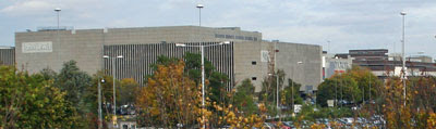
 Until three years ago, the eastbound 'next train' indicator at Bow Road looked like this. Standard mid 20th century issue, just a lightbox with illuminable destinations, all black and simple. The indicator on the westbound platform was held together with sticky tape and was even simpler. No destinations here, just an alternating display to tell passengers whether the next train would be on the District line or the Metropolitan line (highly misleading because the Hammersmith and City usurped the Metropolitan out here way back in 1990). And also no overt indication either as to when the next train would arrive. When a westbound train was expected, the box would light up less than a minute before the train rattled into the platform. If the next train was more than a minute away there were no clues, nothing. A blank box could mean two minutes (wait on platform), could mean ten (exit station and walk to Mile End), could mean no trains at all (go home).